Menu
Firefox came to us with a lot of question to uplift their brand and we have all the answers with our designs. We started with core research for the brand & by communicating with their TG and store managers, we found that the biggest gap was the low visibility of ‘Firefox’. So, with BOLD 3D LOGO LIT letters on the back wall – gave them all the answers they were looking for.
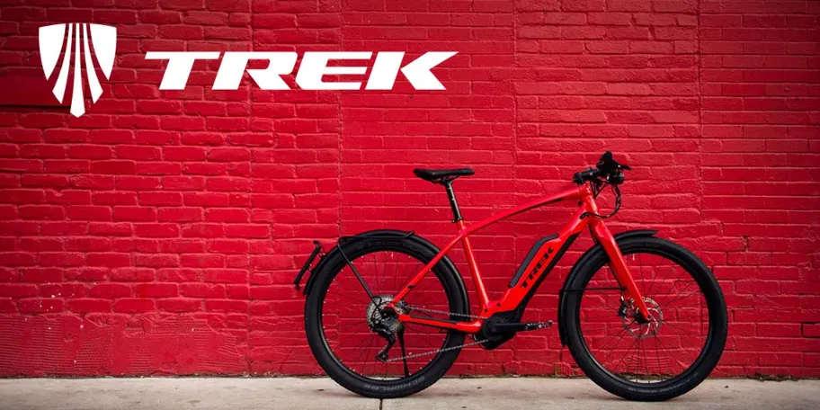
TREK is another brand of FIREFOX which was also suffering from the same “loose visibility” problem. Again BOLD 3D LOGO LIT letters on the back wall gave them, desired visibility.
