BERGER PAINTS


Berger Paints has a rich history in India and has undergone some significant changes that have proven successful throughout its many years of operation. Over the course of its 88-year existence, the brand has made its mark in India, bringing vibrant color to households and enhancing people's lifestyles with fresh, new strokes.
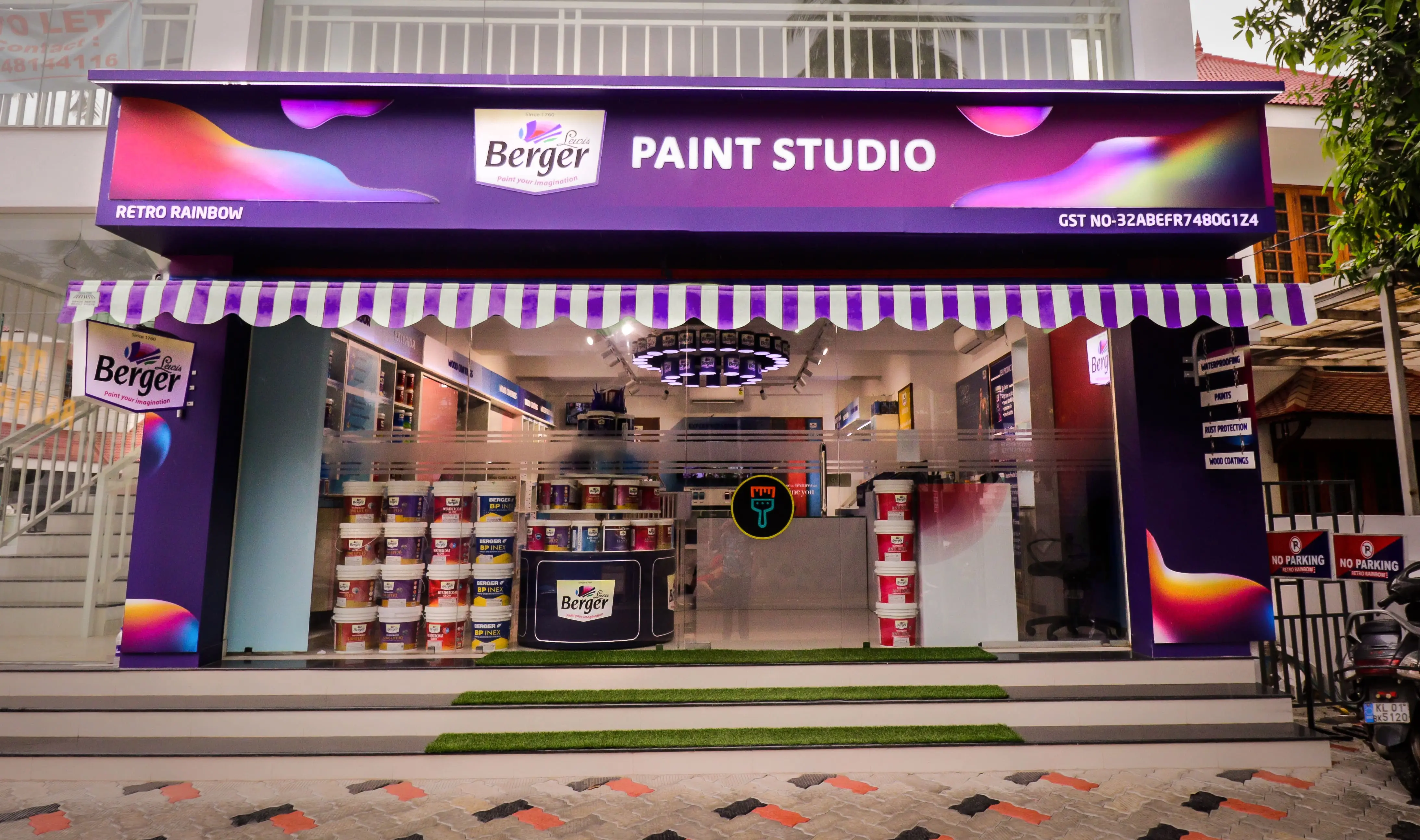
When the brand enlisted D'Art's help to improve store identification through design and branding, we knew we had to use our imagination to create a strong connection between Berger's colors and the customer.
The client's desire for a unique storefront inspired the design of the store's interior, which seamlessly integrates with the exterior signage and branding. Following the brand guidelines, we incorporated the Mesh Color Lava Shape into the facade signage, showcasing the full potential of color fusion while simultaneously stimulating the imagination of consumers without overwhelming them. This design approach aligns with Berger's core principle of "Paint Your Imagination."

We created dangling signage for Berger's storefront with a Victorian feel, emphasizing Berger's heritage and ethos from afar.
We incorporated sustainability into the store's design by using our artistic creativity. We repurposed empty paint containers to create a chandelier, highlighting the vibrant energy of the paint studio and showcasing the brand's eco-friendly values. The result is visible from the exterior of the store.
Similar to its namesake, the retail outlet was a paint studio where customers could experience the true colors and identify the best finishes for their homes. The layout was designed with ample space for customers to view Berger's products up close. The categories of Paints and Putty are clearly labeled, and there is a shelf dedicated to Interior & Exterior Paints, showcasing the brand's range of collections for specific uses. Through this USP wall, we gave customers a better understanding of the brand's offerings.
 |  |
We incorporated an Island unit in the design layout, specifically designed as an Experience lounge for the brand's valued customers. It provides the perfect setting for discussing color schemes, textures, combinations, and other factors that contribute to creating a lively ambiance in their homes. Each section of the unit offers consumers a first-hand experience of the products. We intended to let the inspiration gush into the consumers when they stay, try & decide and make it happen with the final purchase.
We emphasized designing an experience section, which doesn't just allow consumers to feel the textures and find the best wood coating. But also created a live-demo space to compare and contrast samples placed on specially designed shelves. This ensures a seamless blend of both functionality and aesthetics.
We did not forget to add the VM strategy to be visible on the store facade, with a placement of a revolving 3-tier model to display the newly arrived product range, grabbing visitors’ attention at the threshold. Besides, the checkout area had a Point-of-Purchase Placement strategy, with DIY materials, for the creative customer type, who likes to play with colors to redo their place of paradise.
The culmination of the design brought forth a perfect experience center for Berger, giving the user a rigorous amount of detail about the product range, & look, and feel. We perfectly summarized the brand’s reflection inside the store for the visitors to live their choice in the best way possible.

